
With a day to go, the S&P 500 is up a very impressive 3% during the historically weak month of August. That’s the good news. The bad news? September is around the corner, and some of the worst months ever have taken place during this month.
Another Solid Week
The two big events last week both did little to put a dent in the rally. First off, a major semiconductor manufacturer (that also happens to be the largest stock in the S&P 500 by market cap) reported very strong earnings and guidance, and the stock gained more than 8%, sparking the AI and tech trade. Then the Federal Reserve held its annual Jackson Hole Symposium on Friday, and there were no major curveballs there.
Historically the Worst Month of the Year
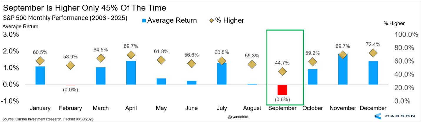
September is the worst month of the year for the S&P 500, down 0.6% on average and higher only 45% of the time. Both are the lowest out of all 12 months. February is the only other month with a negative average return, and no other month is higher less than 50% of the time.
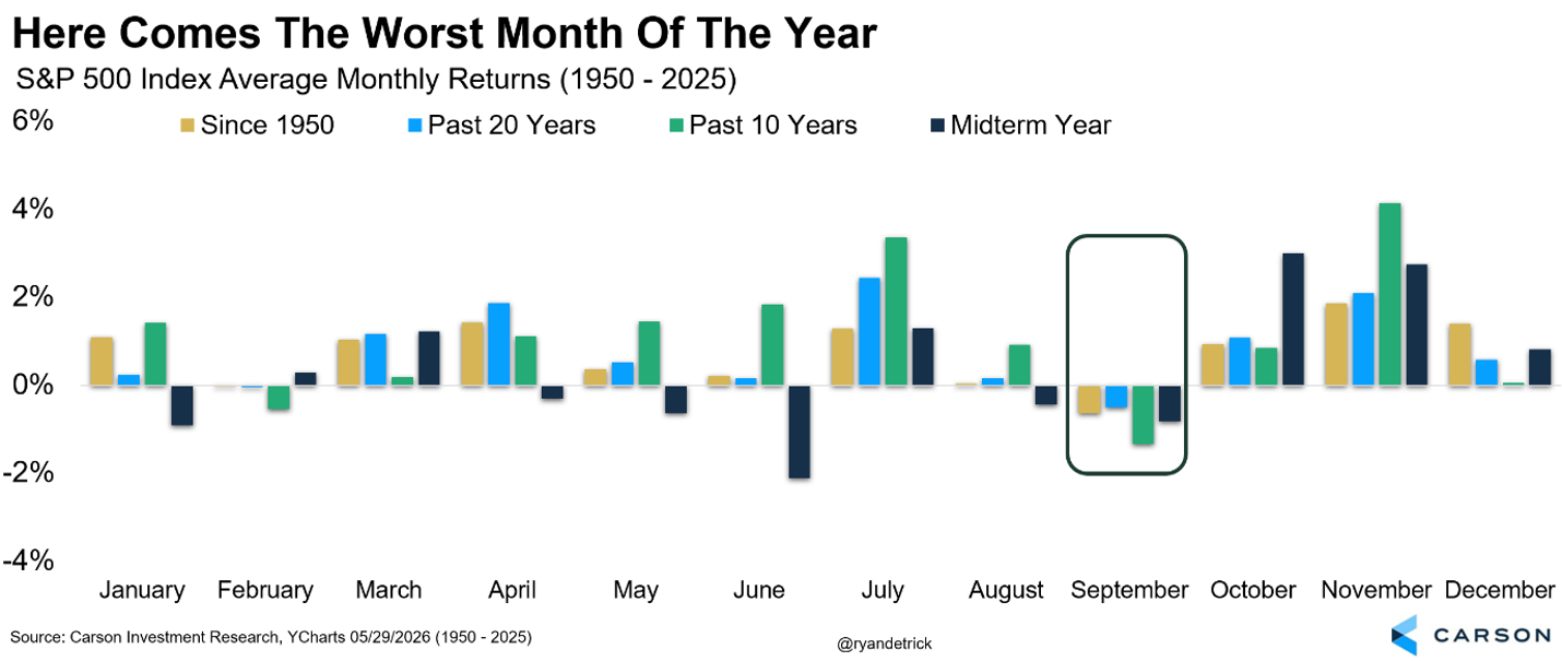
Not only is September the worst month since 1950, it’s the worst month over the past 10 years, the worst month over the past 20 years, and the third worst month in a midterm year (only January and June are worse).
But just as August historically isn’t a strong month and yet we are looking at a solid return, there are some clues that this year could buck the bearish trend and that this month isn’t one to fear.
The Trend Is Your Friend
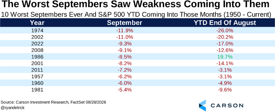
Some of the very worst September returns ever took place during weak markets, but this year, the S&P 500 is up close to 13% for the year and a good day or two away from new highs. In fact, the four worst Septembers ever saw the S&P 500 down year-to-date heading into the month, and down at least double digits each time. Only one out of the 10 worst Septembers ever saw stocks higher for the year heading into September.
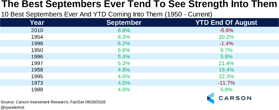
Building on this, looking at the 10 best September returns ever shows that seven of them saw a positive return heading into them. With stocks up close to 13% so far in 2026, this could be a clue that a large drop this September isn’t likely.
August Is the Clue?
Could the strong yearly return so far, along with a solid August, be another clue? It very well could be.
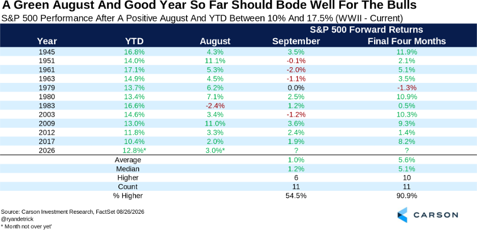
We found 11 other times August was higher while the S&P 500 was up for the year between 10% and 17.5%, so a solid year, but not a super strong year. September was higher six out of 11 times here, with a solid median return of 1.2%. But it’s the rest of the year that really caught our attention. The final four months gained 10 out of 11 times, with a very strong 5.6% average return.
Third Time’s the Charm
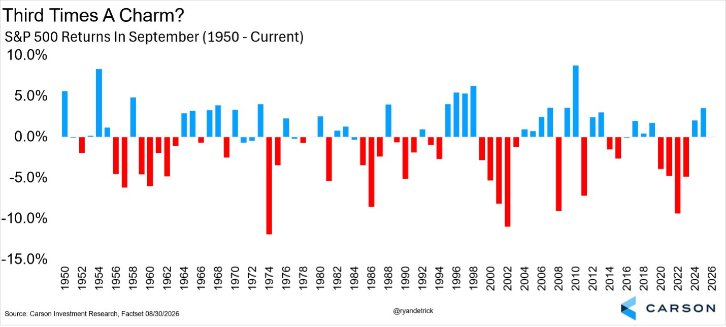
The S&P 500 gained 2.0% and 3.5% in September the past two years. Only once in history has it gained more than 2% three years in a row, and that was a record four years in a row in the late 1990s. Could this year be three in a row? We think there is a better chance of this than most.
Should Interest Rates Be Even Higher?
Treasury Secretary Scott Bessent said recently that Treasury was running its buyback program of 10- to 30-year Treasuries because yields on the long end of the curve didn’t reflect fundamentals:
“We have a big toolkit. Part of it is signaling here to show that we believe yields don’t reflect the underlying fundamentals of this Iran conflict. We will get on the other side of this.”
That begs the question: Are yields reflecting fundamentals?
One way to approach the question is to look at nominal GDP and where interest rates should land relative to it. Interest rates compensate investors for real returns plus expected inflation. Nominal GDP growth combines the same forces: real growth plus inflation.
Nominal GDP growth is essentially nominal income growth in the economy, since gross domestic income should equal GDP except for measurement issues. Over time, nominal rates should move with nominal GDP growth, assuming some equilibrium. There are three reasons for this.
- Monetary policy: A 4% policy rate means very different things in an economy growing at 4% versus 6%. If the Fed keeps rates unchanged while nominal GDP is elevated, policy is essentially getting easier, as incomes rise relative to borrowing costs.
- Debt dynamics: If borrowing costs are 4% while nominal GDP grows 6%, then the debt is easier to service, including for the government. What matters is the interest rate relative to nominal income growth.
- Bond market dynamics: A 4% medium-to-long-term Treasury yield when nominal GDP is growing 6-7% is likely too low unless investors expect growth and/or inflation to collapse. Faster nominal growth usually means more credit demand and higher inflation.
Of course, this doesn’t mean interest rates should exactly match nominal GDP growth. In fact, the Fed policy rate typically runs a percentage point or two below nominal GDP. But think of nominal GDP like a magnet.
Rather than look across all of history, we thought it would be interesting to compare today with the late 1990s tech boom, an obvious analogy.
Nominal GDP Growth Is Running Close to the Late-1990s Pace, but Not Rates
Nominal GDP, which is real GDP growth plus inflation, averaged 4% annualized from 2010-19 and has picked up since 2020 thanks to higher inflation. Here’s a comparison of nominal GDP growth since 2024 with 1995-99:
- Over the last 10 quarters (2024 Q1 through 2026 Q2), nominal GDP growth averaged an annualized pace of 5.5%.
- Over the five years from 1995-99, nominal GDP grew at an almost identical annualized pace of 5.8%.
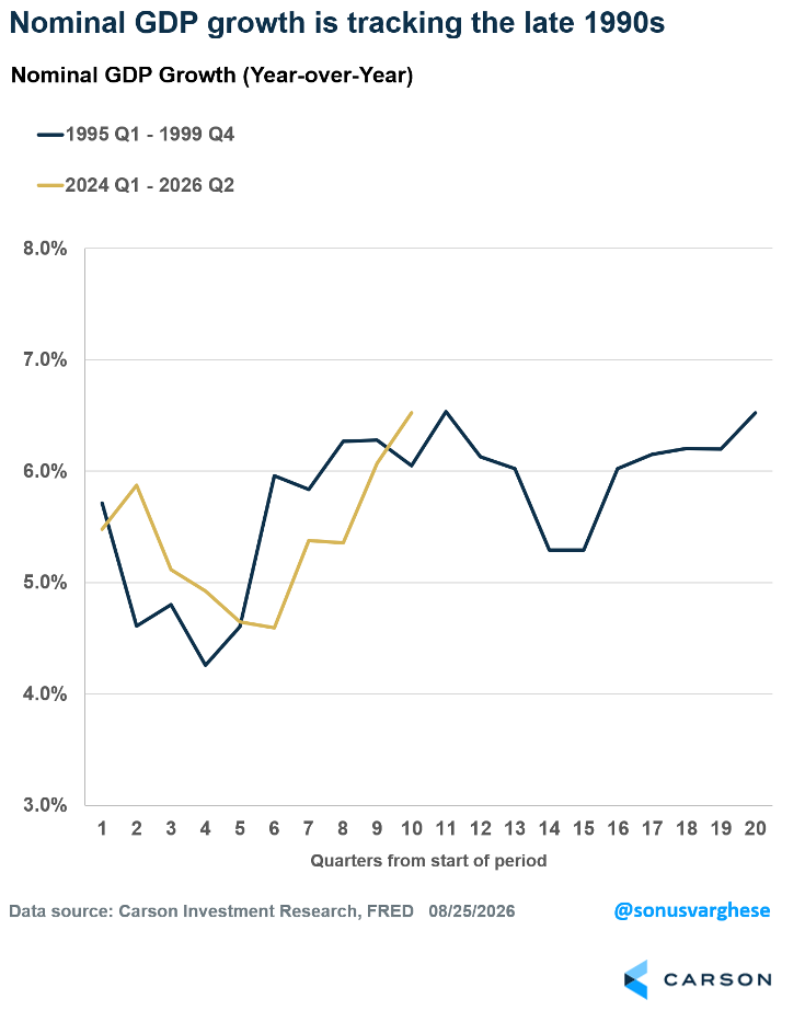
In short, nominal GDP is running close to the 1990s pace. The 6.5% year-over-year growth in 2026 Q2 matches the highest pace we saw back in the 1990s (Q3 1997).
And right now, it’s mostly an inflation story, in contrast to the mid-to-late 1990s.
- Real GDP growth from 1995-99 averaged 4.2% annualized, roughly twice the pace of the prior 10 quarters.
- Inflation, using the GDP deflator, averaged 1.6% annualized in the 1990s, versus 3.4% from 2024 onward.
Productivity growth has also eased. It clocked in at 2.1% annualized from 2024 through 2026 Q2, above the 2005-19 pace of 1.5% but below the 2.7% pace from 1995-99.
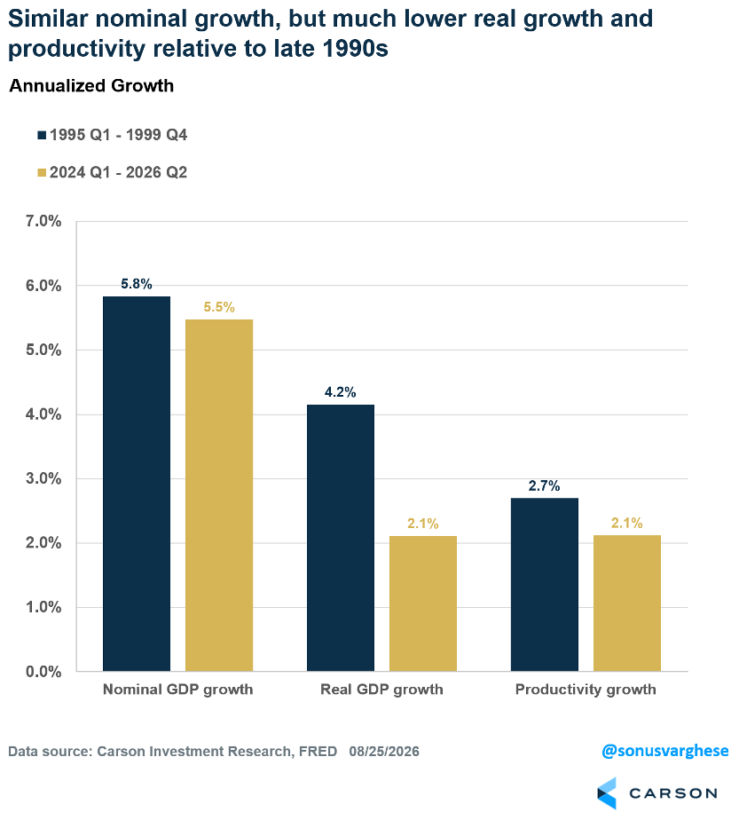
The late 1990s had low inflation and strong real growth, supported by productivity and labor force growth. We have almost the opposite now: Labor force growth is at a standstill and real output is below trend. But inflation is running hot, pushing nominal GDP growth toward late-1990s levels.
How the Level of Interest Rates Compares
But how does the level of interest rates compare? You would think they should be about the same. High inflation should pull rates up; below-trend but better than anemic real growth should pull them down a little. But rates at both the short and long end of the yield curve are lower than in 1995-99.
- Three-month rates, a proxy for the policy rate, are below late-1990s levels, and the gap widened after the Fed’s rate cuts over the past two years.
- Ten-year yields are also much lower. The 10-year fell to 4.16% in 1998 after Long-Term Capital Management collapsed, but rebounded to 6.4% by the end of 1999.
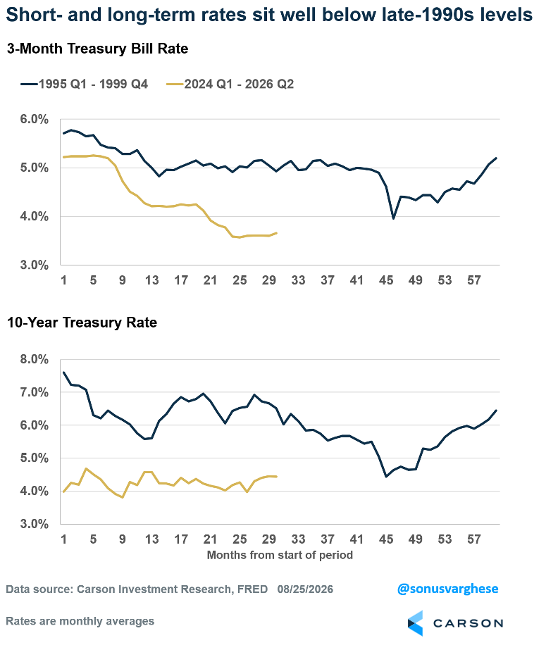
Here’s a look at the overall averages:
- From 1995-99, the three-month rate averaged 6%, compared to 4% from 2024 through 2026 Q2.
- From 1995-99, the 10-year yield averaged 6%, versus 4% in the recent period.
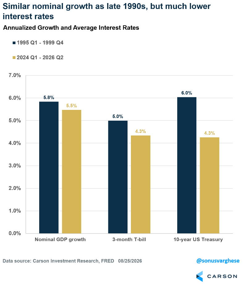
In other words, the Fed is running policy pretty easy despite nominal GDP growth near 6%, a nominal growth rate similar to the mid-to-late 1990s and above the 2010-19 trend of 4%. The reason is elevated inflation. If you thought that was coming down, you might adjust, but it doesn’t look headed back to 2% anytime soon.
You could argue long-term yields are finally “normalizing,” but they remain well below 1990s levels. The fiscal backdrop is also radically different: We had a budget surplus of almost 1% of GDP in 1999 (and haven’t had one since) versus a deficit near 6% today, while the primary balance swung from +4.5% to about -2%. That means much more Treasury supply to fund spending and upward pressure on yields. Meanwhile, AI is increasingly competing with the government for credit. As we wrote in a prior blog, the AI capex boom needs enormous capital as financing shifts from free cash flow to debt.
Long-end yields could stay below 1990s levels if investors expect inflation and growth to pull back significantly. If that doesn’t materialize anytime soon, as we expect, yields could be pulled higher, probably with a whole lot of kicking and screaming.
S&P 500 — A capitalization-weighted index of 500 stocks designed to measure performance of the broad domestic economy through changes in the aggregate market value of 500 stocks representing all major industries.
The NASDAQ 100 Index is a stock index of the 100 largest companies by market capitalization traded on NASDAQ Stock Market. The NASDAQ 100 Index includes publicly traded companies from most sectors in the global economy, the major exception being financial services.
The views stated in this letter are not necessarily the opinion of Cetera Wealth Services LLC and should not be construed directly or indirectly as an offer to buy or sell any securities mentioned herein. Investors cannot invest directly in indexes. The performance of any index is not indicative of the performance of any investment and does not take into account the effects of inflation and the fees and expenses associated with investing.
A diversified portfolio does not assure a profit or protect against loss in a declining market.
All investing involves risk, including the possible loss of principal. There is no assurance that any investment strategy will be successful. This information is from sources believed to be reliable, but Cetera Wealth Services, LLC cannot guarantee or represent that it is accurate or complete.
9101939.1-0826-C
